Disclosure : This post may contain affiliate links or paid partnerships. I may earn compensation if you click a link or make a purchase, at no additional cost to you. See my disclosure for more info.
Every design choice sends a signal.
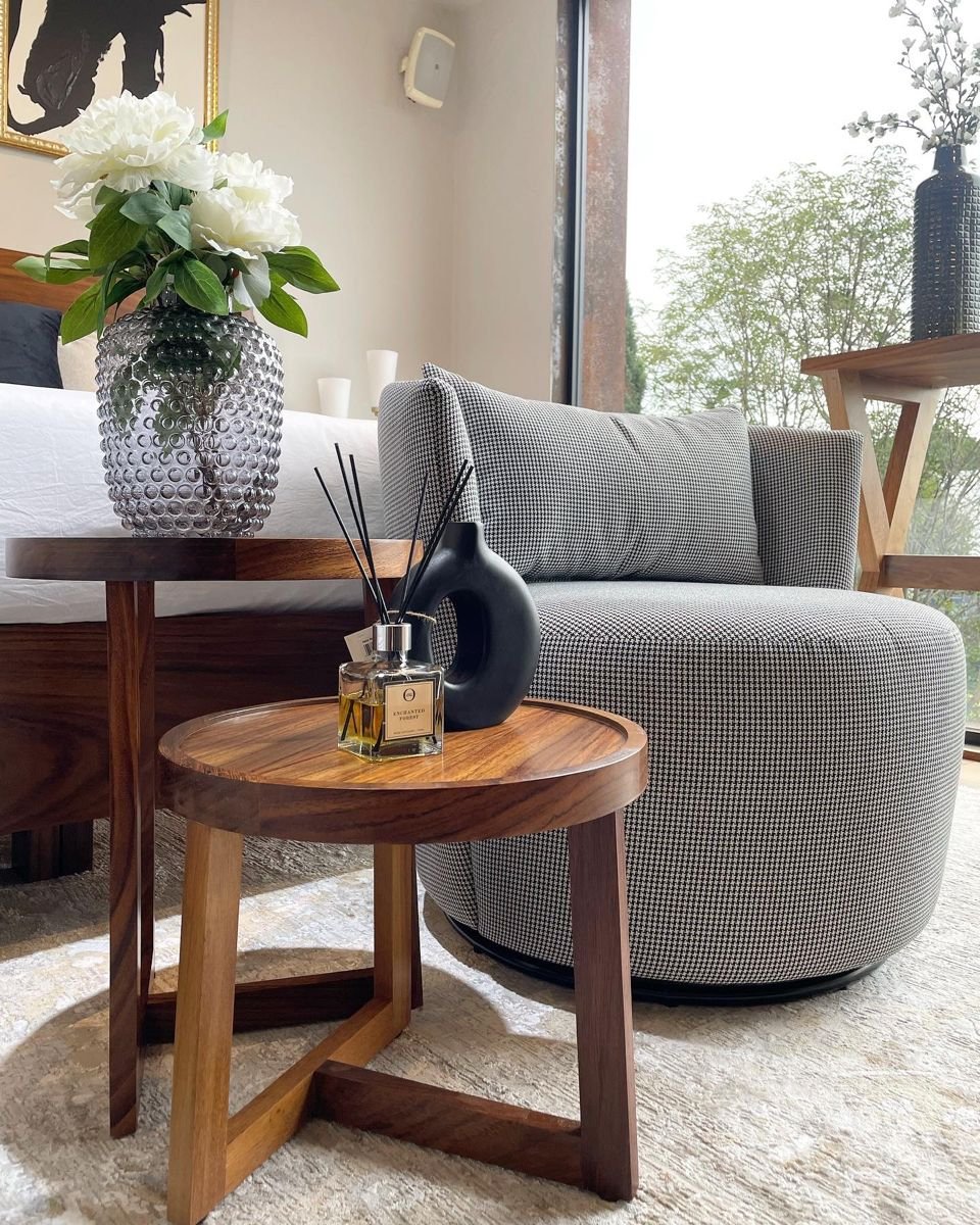
A side table covered in random objects says: nobody thought about this. A side table with three well-chosen items at different heights says: someone lives here who pays attention.
The difference isn’t money. It’s not even taste. It’s understanding why certain arrangements work — and then applying those reasons with intention.
Design is not arbitrary. Proportion, texture, light, and scale all follow principles rooted in how human perception actually works. Once you understand those principles, you can apply them anywhere.
Including your side table. Especially your side table.
These 27 tips come paired with the reasoning behind each one — because knowing why something works makes it far easier to replicate.
Why These Four Rules Underpin Everything
1. Clear the surface before you add anything.
The reason this works: visual processing is sequential, not simultaneous.
When we look at a surface, the eye scans for patterns and resting points. Clutter prevents the eye from finding either — it keeps scanning endlessly, creating visual fatigue. A cleared, clean surface gives the eye somewhere to land and allows subsequent objects to register individually. Start from zero or nothing else on this list will function as intended.
2. Group three objects together.
The reason this works: odd-numbered groupings exploit a perceptual principle called the Law of Pragnanz.
Our brains naturally seek the simplest possible interpretation of visual information. A group of three creates a triangular visual pathway — the eye moves between the objects and completes a loop. Groups of two feel unresolved. Groups of four or more feel unstable. Three is the sweet spot for visual closure.
3. Vary the heights of your objects.
The reason this works: our eyes are drawn to movement, even implied movement.
Varied heights create a visual rhythm — the eye moves up and down across the arrangement rather than scanning along a flat horizon line. This perceived motion keeps the viewer engaged. Objects at uniform height provide no such movement and register quickly as uninteresting. Book stacks create instant height variation without additional purchases.
4. Anchor with one dominant focal element.
The reason this works: the brain requires a visual hierarchy to feel comfortable in a space.
When all objects compete equally for attention, the visual cortex works harder to resolve the scene, creating mild but real discomfort. A clear hero element — a sculptural vase, a bold lamp, a striking clock — gives the eye an entry point and allows everything else to register as supporting context. The scene resolves. The brain relaxes.
The Psychology of Ambient Light
5. Use a table lamp rather than relying on overhead lighting.
The reason this works: light direction triggers emotional associations.
Overhead lighting is associated with functional environments — offices, hospitals, retail spaces. It signals productivity, not rest. Upward-casting light from a table lamp creates warm, low-angle illumination that the human brain associates with natural firelight and candlelight — conditions under which humans have historically relaxed and felt safe. The switch is physiological as much as aesthetic.
6. Choose a cordless lamp to keep the surface uninterrupted.
The reason this works: visual continuity reduces cognitive load.
The human eye naturally traces lines — including power cords. A cable running from the table to the outlet forces the visual system to follow an unintended path that exits the composition entirely. A cordless LED lamp eliminates this interruption, keeping the eye within the arrangement rather than escaping it along a wire.
7. Place a candle beside the lamp to create layered light.
The reason this works: multiple light sources at different heights create three-dimensional visual depth.
A single light source casts shadows in one direction, flattening a space. Two sources — a candle and a lamp at different heights — create overlapping shadow patterns that give the room genuine dimensional depth. The eye reads this as a more complex, more interesting environment.
Why Layers Create Visual Interest
8. Stack books to build a layered base.
The reason this works: layering mimics how we experience natural environments.
Human visual systems evolved in environments with multiple overlapping planes — foreground, midground, background. Arrangements that replicate this layering feel natural and comfortable. A stack of books with an object on top creates an immediate foreground-background relationship that reads as visually complete. It costs nothing if you own the books.
9. Select book spines that align with your room’s palette.
The reason this works: color dissonance pulls attention involuntarily.
The human visual system flags color anomalies faster than conscious thought. A spine that clashes with its surroundings becomes an involuntary focal point — the eye is drawn to the disruption rather than to the intended arrangement. Color coherence allows the composition to breathe uniformly and keeps the viewer’s attention where you want it.
10. Use a small tray to define the arrangement’s boundary.
The reason this works: enclosed groupings trigger Gestalt perception.
The Gestalt principle of closure tells us that the brain automatically groups objects within a shared boundary. A tray creates that boundary, prompting the brain to perceive its contents as a single unified composition rather than isolated objects. Without the tray, the same objects require more cognitive effort to read as coherent.
The Biophilic Effect: Why Nature Belongs on Your Table
11. Include at least one living plant element.
The reason this works: biophilia is a documented human psychological tendency.
Research consistently shows that exposure to living plants reduces cortisol levels and lowers perceived stress. A small potted plant, a stem in a bud vase, or a small succulent on your side table isn’t just decorative — it produces a measurable calming effect in everyone who sits near it. The organic irregularity of plant form also provides visual variety that manufactured objects cannot replicate.
12. Use dried botanicals as an organic alternative.
The reason this works: the biophilic response is triggered by organic form, not just living material.
Dried eucalyptus and pampas grass retain the irregular, asymmetric qualities of living plants. The visual system responds to these organic cues similarly to how it responds to real plants — with a slight relaxation response. The benefit is present even without watering. The natural form is enough.
13. Add a sculptural natural object like driftwood or a branch.
The reason this works: found natural objects carry what psychologists call “prospect-refuge” cues.
Objects that suggest natural environments — a branch, a weathered stone, driftwood — tap into deep evolutionary associations with safe, resource-rich environments. They make a room feel grounded. They also introduce the raw, unprocessed texture that provides maximum contrast against manufactured objects.
Material Contrast and the Visual Brain
14. Mix at least two contrasting materials.
The reason this works: material contrast creates visual texture in the same way tonal contrast creates depth in a painting.
A ceramic vase paired with a brass candle holder, or glass beside a woven basket — the interplay between smooth and rough, hard and woven, reflective and matte generates the visual complexity that keeps the eye engaged. Single-material compositions have nothing for the eye to discover. Contrast gives it somewhere to go.
15. Add a textile element to the arrangement.
The reason this works: textiles trigger tactile empathy in the visual system.
Research on embodied cognition shows that the visual cortex partially activates touch-related neural pathways when viewing textured surfaces. A woven coaster, a linen cloth, or a macramé plant hanger invites this response — the viewer feels the warmth of the textile even without touching it. This contributes to the overall sense of comfort a well-styled surface generates.
16. Include one metallic accent.
The reason this works: specular highlights attract visual attention efficiently.
The human visual system is particularly sensitive to bright, localized light sources — an evolutionary adaptation for detecting water and fire. A metallic element like a brass picture frame creates a contained specular highlight that the eye is drawn to reliably. Used once, it becomes an intentional focal accent. Used multiple times, it competes with itself and loses the effect.
The Psychology of Personal Objects
17. Feature one genuinely meaningful personal object.
The reason this works: personal objects trigger narrative processing in viewers.
When we encounter an object that clearly carries personal significance — something worn, distinctive, or clearly non-commercial — our brains automatically generate narrative questions: who does this belong to? What does it mean? This narrative engagement creates a deeper emotional connection with the space than any amount of commercially perfect styling can achieve.
18. Lean a small framed image against the wall.
The reason this works: leaned objects suggest ease and confidence.
A 4×6 or 5×7 framed print resting informally against a wall communicates that the inhabitant is comfortable in their space — secure enough not to need everything perfectly mounted and permanent. This psychological reading of “ease” translates to how visitors feel in the room. Paradoxically, less formal arrangement creates more comfortable spaces.
19. Keep a small dish for everyday items.
The reason this works: designated places for frequently-used objects reduce ambient cognitive load.
Every time we see a key or ring sitting undefined on a surface, some small part of our attention allocates to the question of where it belongs. A beautiful small dish resolves this question permanently. The brain registers the object as “placed intentionally” rather than “left carelessly” and releases the small anxiety that comes with visual disorder.
Proportion, Scale, and the Comfort Zone
20. Leave significant negative space on the surface.
The reason this works: visual rest is neurologically necessary.
Just as silence gives meaning to music, empty space gives meaning to objects on a surface. When every inch is occupied, the visual system cannot rest — it keeps scanning for something to prioritize. Open surface area provides that rest, which paradoxically makes every object on the table appear more significant and more intentional.
21. Scale objects proportionally to the table and room.
The reason this works: our brains use surrounding objects to calibrate size expectations.
When an object is grossly disproportionate to its surroundings, the mismatch requires the visual system to resolve two conflicting size signals simultaneously. This creates mild but real discomfort. Proportional objects feel right because they confirm rather than challenge our spatial expectations. Scale is comfort.
22. Apply the 1.5x lamp shade height rule.
The reason this works: the lamp shade establishes the visual “ceiling” of the horizontal composition.
When objects exceed this ceiling significantly, the arrangement appears structurally unstable — the visual system registers it as potentially falling, triggering a low-level alertness response. Keeping tall objects within 1.5x the shade height maintains the perception of structural stability and allows the viewer to relax in front of the arrangement.
Multi-Sensory Design and the Long-Term Impression
23. Add a scented element to engage olfaction.
The reason this works: olfactory memory is the most persistent and emotionally potent of all sensory memories.
A scented candle or reed diffuser associated with your space will be remembered longer and more vividly than any visual detail. Scent bypasses the thalamus and connects directly to the amygdala — the brain’s emotional center. A consistently pleasant scent in your living room creates a felt sense of welcome that visitors carry with them long after leaving.
24. Rotate one seasonal element throughout the year.
The reason this works: novelty triggers dopamine release and sustains attention.
The brain habituates to static environments — familiar scenes stop being consciously registered over time. Introducing a single new element with each season reactivates conscious attention without creating the cognitive discomfort of complete change. One new object refreshes the entire arrangement’s novelty signal.
25. Elevate one key piece on a pedestal or coaster.
The reason this works: vertical position signals importance across virtually all human cultures.
Objects placed higher than their surroundings are universally perceived as more significant, more powerful, more worthy of attention. A marble coaster under a candle — raising it by a mere inch — activates this deeply embedded perception. The elevated object reads as the most important element in the arrangement at a level below conscious awareness.
26. Edit and refresh the arrangement monthly.
The reason this works: habituation and renewal operate on a monthly cycle for most decorative objects.
Psychological research on environmental satisfaction suggests that decorative elements become “invisible” — consciously unregistered — after roughly three to four weeks of exposure. Monthly editing interrupts this habituation cycle, keeping the arrangement in the zone of conscious appreciation. The edited table continues to be noticed. The static table becomes furniture.
27. Assess the composition from across the room.
The reason this works: arrangements are experienced at distance, not at arm’s length.
The visual system processes large-scale spatial relationships from across a room — this is when proportion, balance, and overall coherence register. Up-close assessment catches fine detail but misses the compositional gestalt. The distance check is not optional — it is the test that actually reflects how the arrangement will be perceived during everyday use.
Theory Into Practice
Understanding why design principles work makes applying them dramatically easier.
You’re no longer following rules without context — you’re making deliberate choices based on how human perception actually functions. That understanding transfers to every surface in your home, not just the side table.
Choose three principles from this list. Apply them tonight with the reasoning in mind. The materials you need are almost certainly already in your home.
The gap between a room that feels assembled and one that feels designed is not a budget or a professional. It’s the difference between placing objects randomly and placing them with an understanding of why they work where they are.
Your side table is now the most informed surface in your living room.
When someone walks in and says, “Something about this room just feels right” — you’ll know the 27 reasons behind that feeling.