Disclosure : This post may contain affiliate links or paid partnerships. I may earn compensation if you click a link or make a purchase, at no additional cost to you. See my disclosure for more info.
A futon in the living room gets a bad reputation it doesn’t deserve.
The furniture itself isn’t the issue. The way most people position, accessorize, and integrate it is. There’s a gap between the intuitive approach and the trained approach — and that gap is exactly why professionally designed rooms look different from rooms that are simply furnished.
This guide closes that gap.
These are the specific techniques interior architects apply to seating like a futon: positioning strategies, proportion rules, layering logic, and the lighting and color decisions that separate a room that looks assembled from a room that looks designed.
No budget demolition required. No furniture replacement necessary.
Just apply the method.
1) Pull the Futon Off the Wall
Wall-hugging is the first and most widespread futon mistake.
A futon pushed flat against a wall looks like it’s in storage. It reads as waiting, not as living.
Interior architects treat every piece of seating as a spatial element that actively defines the room around it. A futon positioned slightly away from the wall — even three or four inches — produces a shadow line that lends the piece visual weight and the room a sense of depth.
When the futon has a visible frame, that gap is especially important. A frame given breathing room becomes architectural. A frame pushed into a wall simply vanishes.
2) The Rug Rule: Go Bigger Than You Think
Undersized rugs undermine more living rooms than almost any other single mistake.
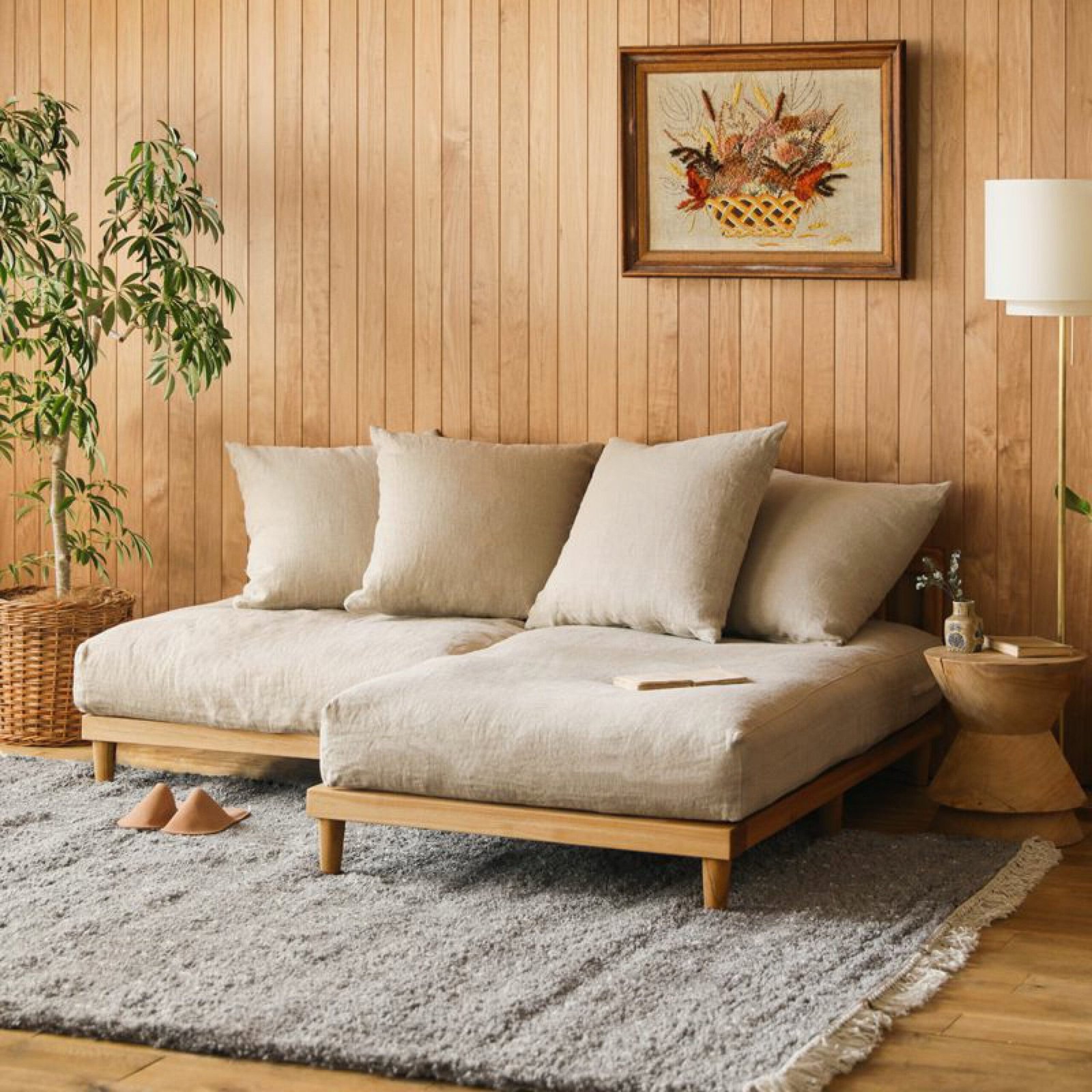
The professional standard is straightforward: the rug must extend beneath at least the front legs of the futon. Ideally, it extends well past both sides of the piece and out in front of it.
This creates a defined seating zone — a spatial container that tells the room “seating area here” with visual clarity.
A jute rug delivers organic warmth without dominating the space. A flat-weave rug adds quiet texture and tonal interest.
The rug is the single highest-impact item in a futon setup. It is not optional, and size is not negotiable.
3) The Asymmetric Throw Method
Centering a throw blanket flat across the futon seat produces a bedspread effect. It signals “bed” instead of “sofa,” which is the opposite of the intended result.
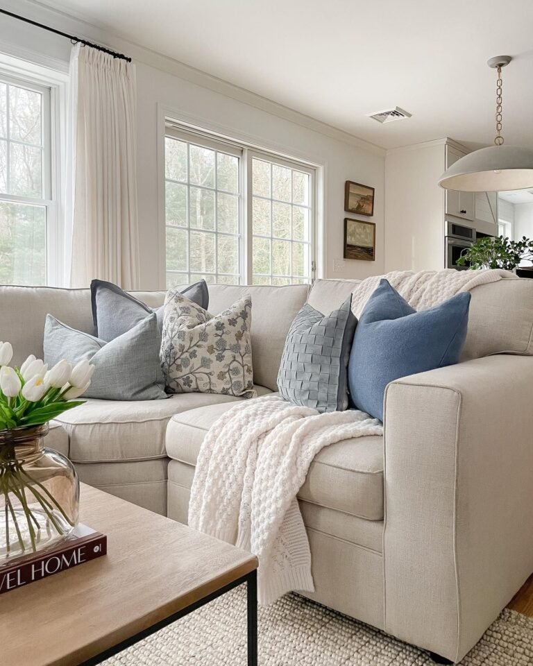
The correct technique: fold the throw into a long rectangle approximately one-third of the futon’s width. Drape it over one armrest so it hangs down the side. Asymmetrical. Off-center. Not spread, not tucked.
Asymmetry is a core tool in the designer’s vocabulary for a reason: it communicates confident informality. It reads as lived-in, not staged.
Select a throw with textural contrast to the futon upholstery. A chunky knit against smooth cotton. A linen throw draped over a tighter weave. Contrasting textures add dimension that reads as “layered” rather than “covered.”
4) The 3–5 Pillow Principle
The formula is simple. Three to five pillows. Odd numbers in design naturally avoid the rigid, paired symmetry that makes arrangements look commercially staged.
Structure them in depth: larger pillows at the rear near each armrest, medium pillows in front overlapping slightly, one small accent pillow positioned off-center.
Vary material and surface: a velvet pillow beside a loosely woven textile. A solid tone beside a muted print. Textural contrast is the difference between a pillow arrangement that looks purchased as a set and one that looks assembled over time with a good eye.
Then do this: introduce a lumbar pillow. The rectangular shape breaks the rhythm of a row of squares and is one of the simplest signals of design intentionality.
5) Place a Side Table at Armrest Height
A side table next to the futon completes the seating area. Without it, the futon reads as unfinished — a piece waiting for the room to catch up around it.
A round side table positioned beside a rectangular futon introduces the circle-meets-rectangle contrast that is a reliable standby in interior design. A wooden stool is the lean, affordable version of the same idea.
Height alignment is critical: armrest level. A side table that floats above or below the arm creates a visual disconnect. Level with the arm, it reads as a deliberate extension of the seating.
The tabletop should hold three elements: a small lamp, a candle, one additional object. That composed trio — a vignette — transforms an empty surface into a scene.
6) Layer Your Light Sources
Ambient overhead lighting is the architectural default, not the designer’s choice. It floods the room evenly, eliminates shadow, and removes the sense of depth that makes a space feel designed.
Add a floor lamp beside or behind the futon. Warm-spectrum, around 2700K, which produces light that reads as golden and inviting rather than clinical.
Then add a second source on the opposite side of the room — a table lamp, a shelf-mounted fixture, indirect warm strip lighting. The goal: multiple pools of light at different heights.
Layered lighting creates shadow, dimension, and warmth. It makes a flat room three-dimensional. This technique appears consistently in every professionally designed interior for the same reason: it works.
7) Activate the Wall Above the Futon
A bare wall above a seating piece is a missed compositional opportunity.
The wall behind the futon functions as a backdrop — a frame for the seating composition. Left empty, the seating area lacks resolution. Addressed well, it completes the setup decisively.
Option one: a single substantial piece of art, centered above the futon, hung at standing eye level. Not higher — the chronic tendency to hang artwork too high is one of the most common styling errors in residential interiors.
Option two: a gallery cluster of three to five pieces, varied in proportion, contained entirely within the futon’s width. Spreading a gallery wall wider than the furniture below it is a proportion error.
Option three: a large round mirror. It amplifies available light, visually expands the space, and adds gravity to the wall without introducing pattern or color.
One option. Executed well. Not combined.
8) Prioritize Traffic Circulation
Spatial flow is the first thing a designer resolves. Aesthetics come after function.
A room where you have to angle sideways to pass the futon will always feel tight regardless of how well it’s styled. Functionality problems undercut visual solutions.
Maintain a minimum of 18 inches on the primary circulation path. Where the room is compact, rotate the futon off-axis slightly. Even a mild angle changes the sightlines, opens up the path, and makes the room feel considerably less constrained.
Furniture that cooperates with movement reads as planned. Furniture that fights it reads as improvised.
9) Introduce a Vertical Element
Typical living room furniture operates in a narrow vertical band — couches, tables, and rugs all sit between zero and thirty inches off the floor. The resulting horizontal monotony flattens the room.
A tall plant positioned beside the futon interrupts that horizontal band and draws the eye upward. A fiddle leaf fig, snake plant, dracaena, or monstera all work well. The variety matters less than the height and the vertical line it contributes.
Place it on the emptier side of the futon, or in a corner where the futon meets the wall.
One plant. That’s all that’s needed. The objective is a vertical counterpoint, not decoration for its own sake.
Insufficient light? A high-quality faux plant delivers the same structural visual benefit without the care requirements.
10) Establish a Three-Color Maximum
Color proliferation is the most common and most invisible source of visual chaos in residential interiors.
The discipline is simple: select three colors, each with a defined role.
A dominant color, covering the largest surface area — typically the futon upholstery and rug. A secondary color for the pillows and throw. An accent color appearing once, in a single decorative object or artwork.
Three colors. Each one used purposefully, not casually.
When a color palette is this disciplined, even inexpensive pieces acquire a sense of deliberateness. When it’s undisciplined, even costly furniture looks accidental.
11) Calibrate the Coffee Table Distance
The spatial relationship between the futon and the coffee table in front of it is a detail that registers unconsciously but powerfully.
The correct interval: fourteen to eighteen inches between the front edge of the seat cushion and the nearest edge of the table. Close enough to use comfortably, far enough not to obstruct.
A coffee table proportioned to approximately two-thirds of the futon’s length is the standard. Shorter and the table looks incidental. Longer and it dominates.
For smaller spaces, two small nesting tables or a round ottoman with a tray offer functional flexibility — both step aside easily when the futon converts to bed configuration.
12) Design for Both Configurations
A futon operates in two modes: sofa and bed. Most styling guidance addresses only one.
Before finalizing the room layout, verify that the futon can fully extend without obstruction. Identify which pieces can be easily relocated and which cannot — and position them accordingly.
A designated basket or bin placed within the seating area serves the transition elegantly. When the futon converts, pillows and the throw go in the basket in seconds. The room remains visually organized rather than becoming a pile of displaced accessories.
A futon that handles both modes gracefully is a better design solution than one that looks good only as a sofa. Design the complete function.
The Futon Was Always a Valid Choice
The furniture was never the constraint.
Futons fail aesthetically not because of what they are, but because of how they are treated — as furniture to work around rather than furniture to design with.
Apply the principles in this guide — spatial positioning, proportion-appropriate rug, layered textiles, controlled palette, correct lighting — and the futon becomes exactly what good furniture should be: an intentional element in a well-considered room.
None of this requires significant expenditure. All of it requires applying a method.
Choose the principle that addresses the most obvious gap in your current setup. Implement it. Then move to the next.
The room you want is already within reach.