Disclosure : This post may contain affiliate links or paid partnerships. I may earn compensation if you click a link or make a purchase, at no additional cost to you. See my disclosure for more info.
Picking a front door color should be simple.
It isn’t.
You’ve lived with the current color long enough to know it isn’t right. It doesn’t represent you. It doesn’t represent the home. Every time you arrive, there’s a moment of mild disappointment you’ve just learned to accept.
You’ve gathered ideas. Spent time looking at what works on other people’s homes. But translating inspiration into a specific color for your specific house is a different challenge entirely.
Your front door is the defining feature of your exterior. More than the landscaping. More than the light fixture. More than the house number. It’s the focal point everything else organizes around.
Right now, that focal point isn’t doing its job.
You know you want green. Something with presence. Something that reads as deliberate — not picked by default but chosen with intention. Something that makes coming home feel like arriving somewhere worth arriving at.
The obstacle is that the green spectrum is vast, and an ill-considered shade — too olive, too bright, too blue-based — can leave you right back where you started.
This guide cuts through that. Here are the best green front door colors, matched to the homes where each one performs, with the specific reasoning that makes the pairing work.
Why Green Belongs on Your Front Door: The Science and the Psychology
Green’s effectiveness as a front door color isn’t coincidental. It’s grounded in both visual science and human psychology.
The human eye resolves green more readily than any other color. It falls at the center of the visible light spectrum, which means our visual system focuses on it naturally and with the least fatigue. Green, in a literal sense, is the easiest color to see.
For a front door, that means instant visual appeal that doesn’t feel aggressive or demanding.
Beyond optics, green holds a distinctive advantage in exterior compatibility.
Most strong accent colors have limitations. Bold red can battle warm masonry. Navy can feel cold in shade. Yellow can shift from inviting to overwhelming based on the amount of trim surrounding it.
Green carries none of those restrictions at scale. Warm brick? Green deepens it. Cool stone? Green brightens it. White siding? Green grounds it.
And then there’s the meaning that green carries regardless of shade. Growth, welcome, vitality, care. A green front door doesn’t just look good — it communicates an invitation before anyone reaches for the handle.
Now for the specific shades that deliver on that promise.
1. Sage Green — Calm, Complex, and Quietly Luxurious
Sage green is the shade for homeowners who understand the difference between bold and obvious.
It reads as sophisticated without making an announcement about it. The gray-based undertones in sage keep it from being purely herbal or earthy — it occupies a more elevated space, closer to a carefully selected neutral than a statement color.
It pairs effortlessly with warm whites, natural linen, aged cedar, and textured stone. It belongs on homes that have depth — farmhouses with real history, coastal properties that have weathered a few decades gracefully.
Sage reads best on warm-toned masonry. If your brick or stone has amber, peach, or golden undertones, sage green will flatter those tones rather than fight them.
The practical warning: Direct, intense sunlight strips sage of its depth. South-facing doors in warm climates often benefit from going a shade or two richer than the original swatch. Paint dries lighter than the chip suggests. Account for that.
2. Hunter Green — The Benchmark, and for Good Reason
Hunter green is the standard against which every other front door color is implicitly measured.
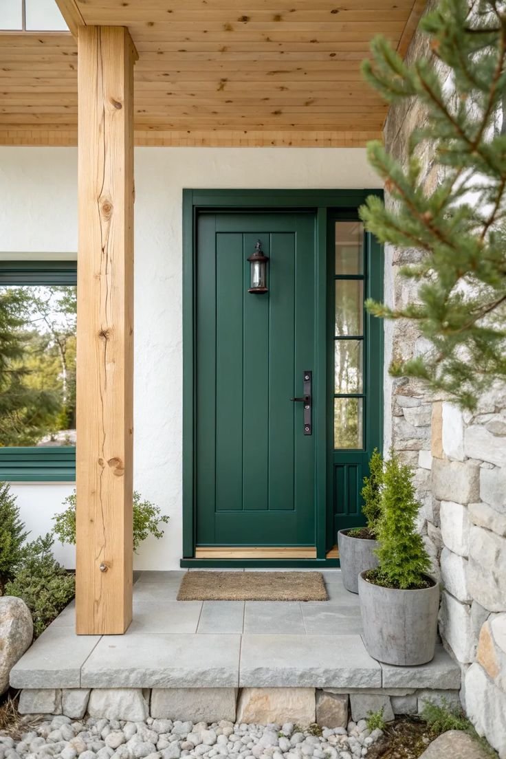
It has anchored distinguished entryways for centuries across multiple continents and architectural traditions. Georgian. Craftsman. Federal. Contemporary. It works because it doesn’t try to fit in — it simply occupies a level where fitting in is irrelevant.
Hunter green functions as a sophisticated dark neutral. It carries the authority of black without the coldness. The richness of deep navy without the tendency to read as blue in certain lights.
For hardware, hunter green + polished brass hardware is one of the most reliably excellent pairings in residential exterior design. Add a Brass door knocker, Brass kick plate, and Brass house numbers, and the entryway achieves a coherence that reads as intentional at any budget.
The one exception: Cool-toned exteriors. Hunter green’s yellow undertones create visual friction against blue-gray or silver-toned siding. If your home runs cool, continue to the options further down.
3. Olive Green — The Color That Knows When to Step Back
Olive green is the introvert of the green family. Reserved, considered, and far more interesting than it initially lets on.
Sitting between green and brown, olive possesses an organic quality that reads as settled and authentic. It doesn’t perform. It simply exists with quiet confidence, allowing the home and its surroundings to carry equal weight.
On properties where the landscape is part of the architectural statement — tree-lined lots, naturalistic gardens, stone-terraced yards — olive green is extraordinarily effective. The door doesn’t interrupt the setting. It integrates with it.
Dark exterior palettes are also natural partners for olive. Charcoal cladding, dark shingles, iron window frames — olive navigates those combinations with a grace that most colors can’t manage.
The caveat: Olive loses something in deep shade. If your entryway is recessed or sits under a projecting roof overhang, test the sample in that specific environment before committing. Showroom fluorescents are not your door.
4. Emerald Green — For the Home That Deserves to Be Seen
Emerald green is not for homeowners who are still deciding how much attention they want. It’s for the ones who’ve decided.
It is, in the truest sense, a jewel tone. Deep, fully saturated, and unapologetically luxurious. It transforms an ordinary entry into something that feels curated and authoritative. The effect is closer to a design decision than a paint choice.
The requirements are straightforward but non-negotiable: bright white trim, high-quality finish, and hardware that either matches the drama of the color or intentionally contrasts it.
Matte black handles and hinges make emerald feel sharp and contemporary. antique brass makes emerald feel storied and classical. Both work. Pick based on the home.
Where emerald performs best: On doors with real panel depth, pronounced molding, or flanking architectural elements. Emerald has the most to offer when the door itself has visual structure. A flat, featureless door risks looking heavy rather than rich.
If your door is plain, start with a paneled door. Then apply the emerald. The difference between a flat door and a well-crafted paneled door in deep emerald is the difference between painted and designed.
5. Forest Green — The Long View in a Color
Forest green communicates something that most colors simply can’t: permanence.
It sits darker than hunter, quieter than emerald, and more grounded than either. Its character is less about visual interest and more about visual weight — the sense that this home has been here, is here, and will continue to be here.
For traditional architectural forms — Colonial, Federal, classic American vernacular — forest green is practically a native species. Against white or ivory trim, black shutters, and a paneled door, it produces the kind of curb appeal that appreciation-per-investment ratio consistently favors.
There’s also a perception effect that research has documented: deeper greens are read by outside observers as indicators of maintenance, care, and thoughtfulness. A forest green door signals, on a subconscious level, that the people inside pay attention.
For homeowners thinking about long-term value — whether in terms of personal pride or eventual resale — forest green is one of the most strategically sound exterior paint decisions you can make.
6. Mint Green — Light, Distinctive, and Completely Its Own Thing
Mint green requires a certain willingness to be noticed differently from your neighbors.
It’s light, fresh, and carries an unmistakably optimistic quality. Done well, it’s one of the most memorable front door colors available. Done carelessly, it tips from charming into casual in ways that are hard to reverse.
Mint is at its most effective on homes where personality is the point: coastal properties, mid-century modern buildings, warm-climate bungalows with strong character. The architectural context needs to support a light, cheerful accent — or mint will fight it.
For mint to succeed at the level of sophistication: minimize everything around it. White or near-white exterior. Clean trim. No competing accent colors. The door should be the singular moment of color in the composition.
When that discipline is applied, mint is genuinely striking. Homes that execute it well tend to become local landmarks in their neighborhoods — the ones people describe by the door color rather than the address.
7. Eucalyptus Green — Soft, Precise, and Effortlessly Modern
Eucalyptus green has become one of the defining exterior accent colors of contemporary residential design, and its rise reflects a broader shift in how architects and designers are thinking about exterior color.
It occupies the space between sage and mint — soft enough to feel considered, cool enough to feel current, green enough to carry genuine color. For cool-toned exteriors, eucalyptus provides a harmony that feels less like a paint choice and more like a design solution.
Gray siding, white brick, pale stone — eucalyptus reads against all of these as though the exterior was conceived as a unified whole from the beginning.
For hardware and accessories: matte black hardware is the natural pairing. concrete planters on either side of the entry. modern house numbers in a clean, modern typeface. The overall effect lands precisely in the modern-organic register that has dominated design-forward residential projects in recent years.
To complete the picture: Frame the entry with potted greenery — living plants, if possible — and the eucalyptus door transitions from isolated accent to integrated element. The entry reads as continuous with the landscape, not separate from it. That continuity is the difference between a well-painted door and a fully designed exterior.
Five Principles for Choosing a Green You’ll Still Love in Five Years
You’ve identified the shade. Now here’s how to be certain before the first drop of paint touches the door.
1. Physical samples are non-negotiable. Digital screens render color with significant variation depending on calibration, brightness, and ambient light. Order peel-and-stick swatches or paint a generous test patch directly on the door. Observe it across multiple days, in multiple light conditions, before committing to a full gallon.
2. Map your fixed constraints first. Roof material, masonry finish, driveway surface, path material — these elements don’t move. The green you choose needs to work harmoniously with all of them. Know what you’re working within before you decide.
3. Finish is a design choice, not an afterthought. The same green in gloss and in satin reads as two different decisions. High gloss amplifies depth and draws attention to every surface imperfection. Satin is forgiving, polished, and appropriate for most residential applications.
4. Paint the door edges. When the door opens, the edge is visible. A door painted beautifully on its face with an unpainted or contrasting edge looks incomplete. Match the edge. It takes ten minutes and changes everything about the perceived quality of the finish.
5. Test the color across all four seasons mentally before committing. Does the shade work in January as well as July? Under a fall wreath in autumn as well as beside summer planters in summer? The best front door colors have year-round appeal. Anything that only works in one season will eventually feel like a seasonal mistake.
The Decision Is Already Behind You
You came here with a problem — a front door that wasn’t working — and you’re leaving with a solution.
You know the shades. You know which ones match your home. You know how to evaluate samples and what to watch for before you commit.
There’s only one variable left: whether you act on it or return to the cycle of indefinite consideration.
The first path: More research, more delay, more seasons passing with an exterior that doesn’t represent you.
The second path: Order the sample for the shade that made you pause. Apply it. Step back. Let the exterior show you what it becomes.
Painting a front door well is a statement that your home deserves to be taken seriously. That the first thing the world sees should be worth seeing.
Fresh. Elegant. Purposeful.
That’s what the right green does from the moment anyone approaches the door.
You know which shade it is. The only remaining step is to go get it.