Disclosure : This post may contain affiliate links or paid partnerships. I may earn compensation if you click a link or make a purchase, at no additional cost to you. See my disclosure for more info.
You keep starting at the same place.
A room that should look great. The right neutral on the walls. Decent furniture. Thoughtful layout.
And yet something is missing.
You can feel it but you can’t name it.
The room doesn’t have energy. It doesn’t have that pull — that feeling you get in beautiful spaces where everything seems to click without effort.
Here’s the honest answer nobody gave you.
Your ivory walls are gorgeous. But they need a partner.
Ivory alone is a whisper. Paired with the right color, it becomes a conversation — layered, warm, full of depth.
Paired with the wrong color? It stays a whisper. Or worse — it becomes a mumble.
This list solves that problem. Permanently.
30 ivory combinations that create real, lasting elegance. Specific pairings. Real results. No guessing.
Let’s build your room.
Why Ivory Outperforms White in Every Room
They look similar on a swatch. But in a room, they’re completely different animals.
White reflects everything — including every imperfection. It’s cold. It’s clinical. It dares you to relax.
Ivory has warmth baked in. A hint of cream. A touch of yellow. It makes light gentler, furniture richer, and people calmer.
White is a hospital hallway.
Ivory is a living room you actually want to live in.
That’s why your choice of ivory was smart. Now let’s make it brilliant.
Rooted and Earthy Combinations
1. Ivory + Walnut Wood
Let’s start with a foundation. Walnut against ivory is possibly the most timeless material-color pairing in design. Warm. Grounded. Ageless.
2. Ivory + Olive Green
Olive green and ivory feel alive. Organic. Like nature decided to furnish your room. Add raw wood elements and you complete the story.
3. Ivory + Sage Green
Where olive is bold, sage is serene. Ivory and sage together create a tranquility that makes bathrooms feel like spas and bedrooms feel like cloud nine.
4. Ivory + Mushroom
That murky, beautiful gray-brown. With ivory, mushroom creates a warm cocoon — the kind of room you retreat to when the world gets loud.
5. Ivory + Sand
Nearly invisible contrast. And that’s the elegance of it. But it demands texture — jute, linen, wool, cotton — layered aggressively to avoid visual flatness.
6. Ivory + Moss Green
Moody. Contemplative. Moss green in an ivory space creates a private retreat. Tuck a reading chair into a moss green corner with ivory walls and you’ll never leave.
Confident and Bold Combinations
7. Ivory + Emerald Green
Jewel-toned. Dramatic. Absolutely magnetic. Emerald is the most luxurious shade you can place against ivory. A single emerald piece — sofa, accent wall, velvet chair — transforms everything.
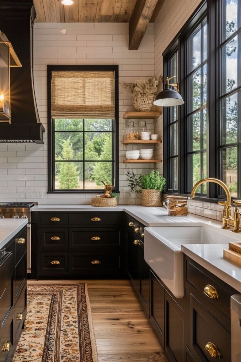
8. Ivory + Black
Not as scary as it sounds.
Ivory neutralizes black’s harshness completely. Black frames. Black fixtures. Black accents. All softened, all elevated by ivory’s warmth.
9. Ivory + Navy
Confident. Grounded. Enduringly elegant. Navy and ivory create rooms that feel both classic and completely current. A pairing that never goes out of style.
10. Ivory + Burgundy
Burgundy is richness personified. Against ivory, it becomes regal — not heavy, not dark, just deeply, satisfyingly opulent. Think velvet. Think curtains. Think statement chairs.
11. Ivory + Plum
Plum requires restraint. Use too much, it overwhelms. Use just enough against ivory — a pair of pillows, an art piece — and it becomes the most sophisticated accent in the room.
12. Ivory + Rust
Rust carries autumn’s warmth without seasonal limitation. Against ivory, it feels earthy and inviting all year round. Brass details seal the deal.
Calm and Cool Combinations
13. Ivory + Slate Blue
The definition of understated luxury. Slate blue and ivory together create a composed elegance that works in bedrooms, living rooms, and anywhere calm is king.
14. Ivory + Charcoal
Charcoal gives ivory structure. Weight. Purpose. A charcoal accent wall behind ivory furniture creates a space that means business — in the most stylish way.
15. Ivory + Cool Gray
Polished. Modern. Crisp. Cool gray and ivory together feel fresh and intentional. Keep your gray slightly warm to maintain comfort.
16. Ivory + Dusty Blue
More romantic than slate. Dusty blue against ivory creates a soft, dreamy atmosphere. Bathrooms and bedrooms soak this pairing up beautifully.
17. Ivory + Steel Blue
Stronger. More focused. Steel blue with ivory feels purposeful and clear. Home offices gain tremendous energy from this combination.
18. Ivory + Pewter
Pewter’s subtle shimmer changes with the light. Against ivory, it adds a quiet gleam — elevated without being flashy. Perfect in hardware and small metallic details.
Welcoming and Warm Combinations
19. Ivory + Camel
The effortless classic. Camel and ivory together look like they were designed by someone who knows exactly what they’re doing. Spoiler: now, that someone is you.
20. Ivory + Terracotta
Terracotta brings the sun indoors. Against ivory, it radiates an earthy glow that makes everyone feel instantly welcome.
21. Ivory + Warm Taupe
Taupe and ivory don’t compete. They harmonize. Layer fabrics — velvet, linen, cotton — and watch two quiet tones build unexpected richness.
22. Ivory + Cognac
Cognac leather. Ivory walls. A combination so consistently gorgeous it belongs in the interior design hall of fame. It simply never fails.
23. Ivory + Burnt Sienna
Earthier and deeper than terracotta. Burnt sienna accent pieces add soul to an ivory room — a warmth that’s visible and almost tangible.
24. Ivory + Honey Gold
Liquid sunshine. Honey gold makes ivory rooms glow from the inside out. Even the grayest weather can’t dim this pairing.
Tender and Soft Combinations
25. Ivory + Blush Pink
Mature. Romantic. Elegant. This blush isn’t childish — it’s the kind of pink that elevates ivory into something truly special. Works in every room.
26. Ivory + Champagne
Two warm shades that together create a soft, radiant glow. Add gold details and the whole space feels festive and luxurious.
27. Ivory + Lavender
A touch of whimsy in a world of safe neutrals. Lavender and ivory surprise guests in the best way. Guest bedrooms and powder rooms shine with this pairing.
28. Ivory + Pale Gold
Candlelight in color form. Pale gold and ivory fill dining rooms with the kind of warmth that turns dinners into memories.
29. Ivory + Dove Gray
Dove gray is the lighter, softer cousin of cool gray. With ivory, it creates a cloud-soft bedroom atmosphere where rest actually happens.
30. Ivory + Cream
Nearly identical. And that’s the point.
The faint difference between ivory and cream creates a layered, tonal sophistication. But it lives or dies by texture. Cream linen. Ivory knit. Cream silk. Ivory wool.
Texture is non-negotiable here. Without it, this pairing is invisible. With it, it’s breathtaking.
The Ratio That Makes Any Combination Sing
Here’s the only formula you need.
60-30-10.
- 60% ivory — dominant across walls, large furniture, primary surfaces.
- 30% your companion color — curtains, area rugs, secondary pieces.
- 10% accent — metallic touches, artwork, small decorative objects.
Too noisy? Pull back the 30%.
Too quiet? Push it forward.
Your eye knows when the balance is right. Trust it. This framework simply helps you get there faster.
Simple. Elegant. Failsafe.
The Texture Trap You Must Avoid
You’ve chosen your colors. You’ve nailed the ratio.
And then you make the mistake that tanks the whole room.
Everything is the same texture.
Same smooth fabric. Same matte wall finish. Same flat weave from corner to corner.
The room looks dull. Lifeless. Like a color swatch instead of a living space.
Here’s the rule: for every ivory surface, introduce at least two different textures.
Ivory walls? Add linen curtains and a boucle throw. Smooth ivory surfaces? Set a woven basket or a chunky knit pillow nearby.
Texture is what gives color dimension. Without it, even the best palette falls flat.
This is the secret most people never learn. Now you know it.
Go Build That Room
Thirty combinations.
A foolproof ratio.
A texture rule that separates “nice” from “extraordinary.”
That’s your toolkit.
Now choose. One combination. The one that made your mind light up.
Walk into the room you’ve been putting off. The one that’s been “good enough” for too long.
Make one move. Swap one thing. Start small.
Because stunning rooms aren’t built with big budgets.
They’re built with intentional color choices.
And yours starts right now.